Reaction video ads for apps: a practical storyboard
Build a reaction-led app video around a real product demo. Includes a four-part storyboard, a ProspectHalo workflow example, and an export review checklist.

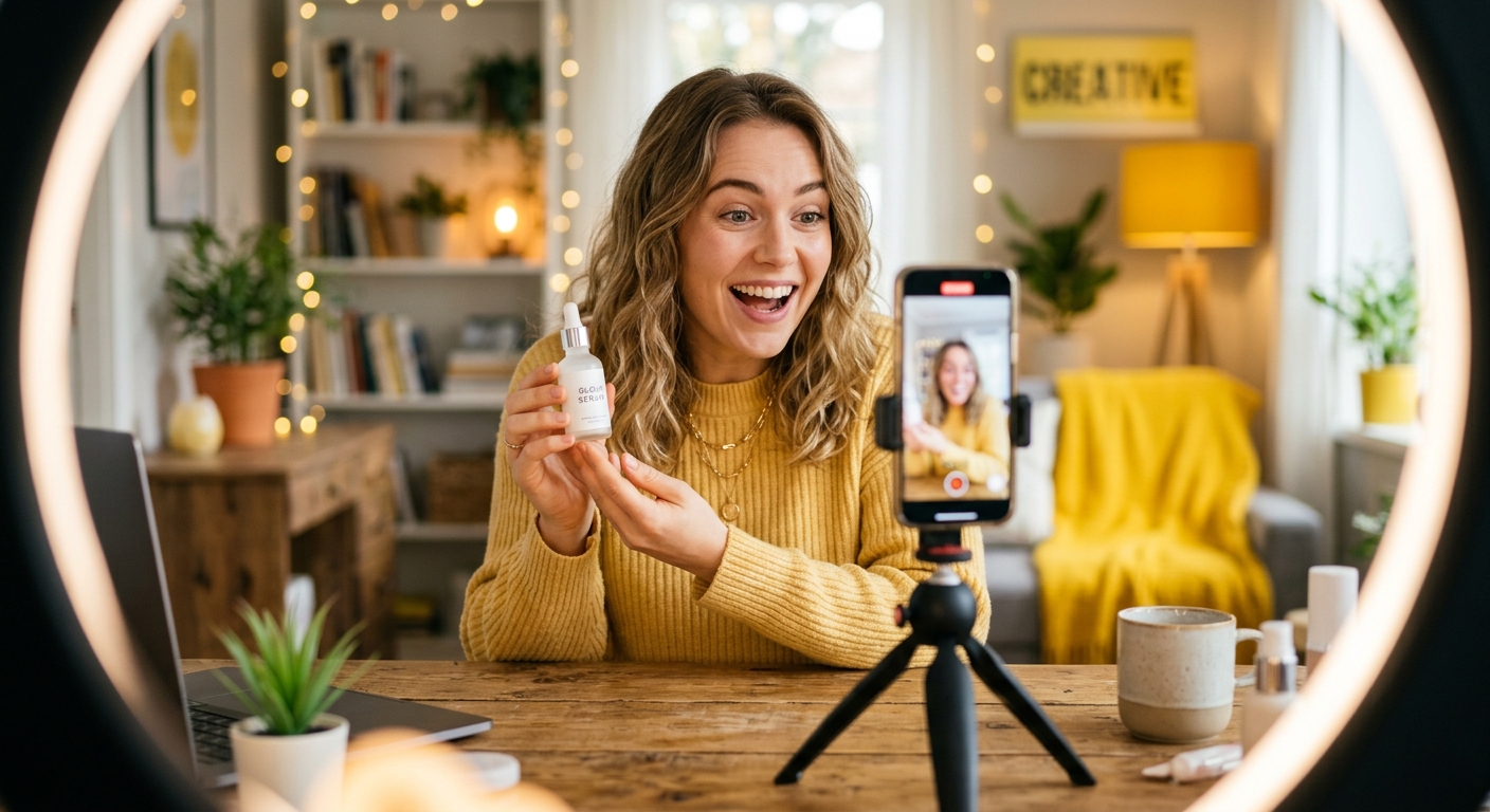
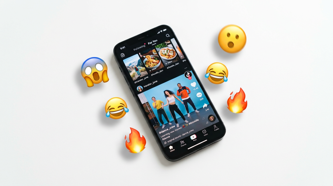
A reaction video ad for an app combines a human opening, an actual product demonstration, and a relevant next step. The reaction introduces the situation. The screen recording explains the app. Neither a surprised face nor a high view count proves that the video will produce installs or paying customers.
Start with the demonstration, then choose the reaction. If the app cannot deliver the result implied by the opening, a better clip will not fix the idea.
Updated September 29, 2026. This guide replaces the earlier unsourced performance benchmarks with a practical storyboard and a clearly identified client example. The storyboard below is a proposed workflow, not a measured winning ad.
What makes a reaction-led app video different?
The defining feature is the relationship between the human footage and the product footage. You might open with an expression of curiosity, show the task on screen, and end with a specific invitation to try it. Or you might show the problem first and use a reaction as the transition into the demonstration.
The format can appear in paid ads or organic posts. Distribution does not change the need for an accurate explanation. An organic Reel is not an app-install campaign merely because it mentions an app, and a website signup is not a mobile installation.
For the broader distinction, see our organic UGC versus paid UGC guide. Here, the narrower job is building the actual sequence for an app use case.
There are also two different production routes. A creator can genuinely use your app and describe that experience. Alternatively, you can license an existing reaction clip and combine it with your own demo. Do not present the second route as evidence of the first.
Build the video around one task
Before selecting footage, finish this sentence: “After watching, someone should understand how the app helps them do ___.”
Keep that task narrow enough to demonstrate. “Organize your life” is not a screen recording. “Turn these meeting notes into a task list” gives the editor an input, an action, and an output to show.
That task-list example is hypothetical. Use your actual product, check what it can do, and replace the example with a workflow you can reproduce. Do not add a time-saving number unless you have evidence supporting it.
Capture the important steps, including a required setup step if omitting it would misrepresent the experience. Remove private information before recording. Use realistic, authorized sample data rather than exposing a customer's notes or account.
Write the opening only after you have watched the demo. This keeps the promise tied to the product instead of forcing the product footage to support an exaggerated hook.
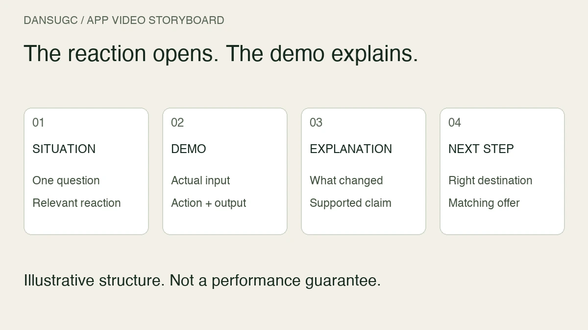
A four-part storyboard for reaction video ads
The timings below are an illustrative editing plan, not a platform specification or an ideal duration established by a test. Adjust the length to show the task clearly.
1. Situation: approximately zero to three seconds
Show the problem or question in plain language. For the hypothetical notes app, the opening could be “Which of these notes are actually tasks?” A reaction clip can accompany that question without claiming the performer has used the app.
Avoid putting an invented personal result in the performer's mouth. “This saved me three hours” is a testimonial-style claim, not just an opening line. If you do not have the evidence, change the line rather than hoping the edit makes it believable.
2. Demonstration: approximately three to twelve seconds
Show the input, the relevant action, and the output. Keep the interface large enough to understand on a phone. If the important result is a task list, show the list instead of leaving it as a tiny panel behind a large face overlay.
Do not accelerate a slow process and then imply that the edited duration is the actual completion time. A shorter edit can omit waiting, but the resulting message still needs to be accurate.
For a product with several features, choose the one that answers the opening question. A tour of every menu usually makes this particular explanation harder to follow.
3. Explanation: approximately twelve to sixteen seconds
Use a short caption or voiceover to say what changed. “The action items are grouped in one list” explains the demonstrated output. “Your productivity will double” introduces a separate claim that the demonstration has not established.
A reaction can punctuate this moment, but it should not replace the explanation. Watch the edit without the reaction layer: the task and result should still make sense.
4. Next step: approximately sixteen to twenty seconds
Send the viewer to the destination that fits the product. A mobile app may use its relevant store page. A browser-based product may use a web signup or a focused landing page. Choose the path that actually exists.
Keep the offer consistent across the video and destination. If a feature requires a paid plan, do not frame it as freely available to every new account. If the video demonstrates one use case, make that use case easy to find after the click.
A real example: ProspectHalo's reaction-plus-demo workflow
Our ProspectHalo case study documents a client using DansUGC reaction footage in organic Instagram content. The founder describes short human openings followed by focused product demos, captions, music, and a call to action. He says most of his reaction clips came from DansUGC.
The division of work is important. DansUGC supplied human footage. ProspectHalo supplied the product demonstration, editing, distribution, and the experience after someone arrived on the website.
This is an organic SaaS example, not a controlled app-install ad test. It does not establish a cost per install, prove that reaction footage caused the reported growth, or predict what another product will achieve. The useful lesson for this guide is the construction of the video: reusable opening footage paired with product-specific evidence.
If your app needs an explanation, copy that separation of jobs. Do not copy someone else's outcome claim into your script.
Choose footage for the storyboard, not the thumbnail
Our annotated reaction examples show three actual DansUGC previews. Carlos's sampled frame has a gym setting; Eliza's is a quieter indoor portrait; Lilia's is a front-facing expressive portrait. Those are visible differences in footage, not performance rankings.
For an app edit, the first question is whether the setting belongs in the story. Gym equipment may fit a training-related task and distract from an office workflow. A quieter portrait might fit a pause before an explanation. These are proposed editing uses, not claims about what the people were thinking or using when filmed.
Watch the entire preview before choosing the segment. Check the entry into the expression, the exit, and the space your caption needs. A still image cannot tell you whether the motion cuts cleanly into your screen recording.
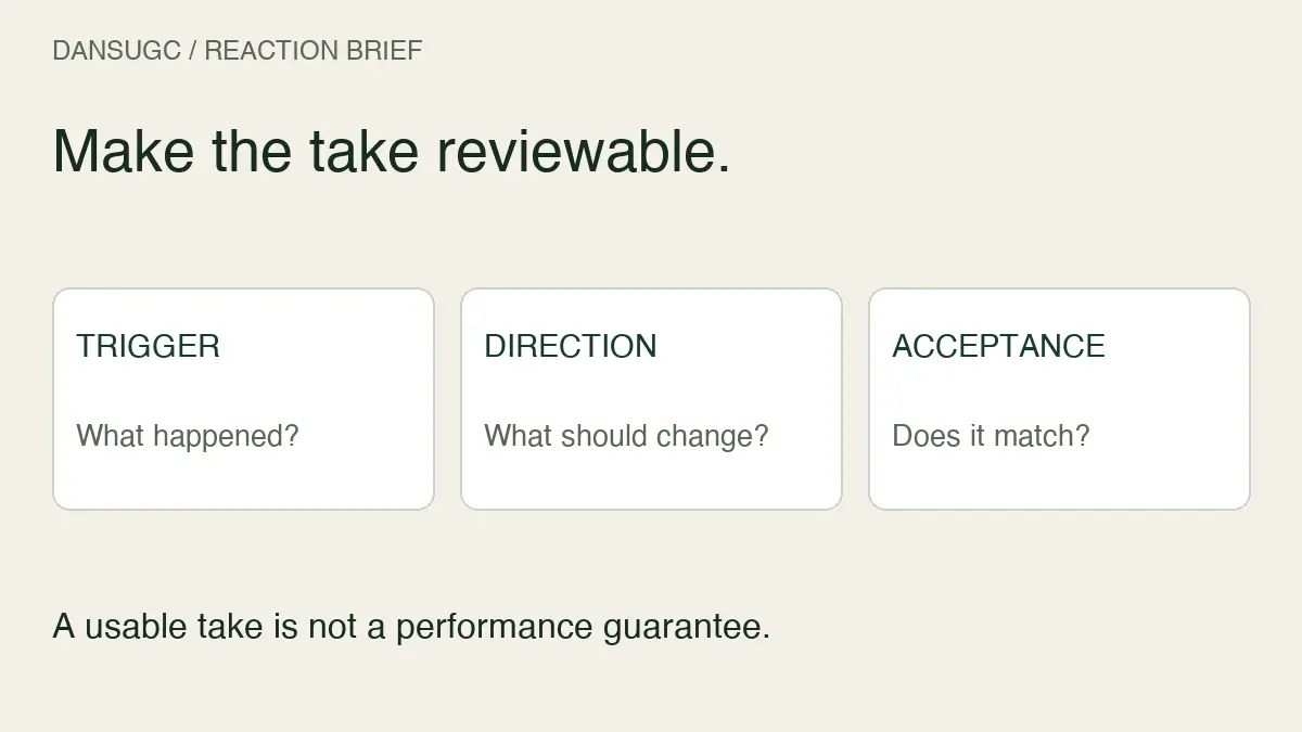
If the concept requires someone to hold a device, operate your app, or give a genuine account of using it, ask for footage that actually captures that activity. A reusable reaction shot does not automatically satisfy a product-demonstration brief. Our reaction-video briefing checklist helps define the required action before production.
Review the finished edit before publishing
Use this checklist on the actual export, not only the editing timeline:
- The opening asks a question the demonstration answers.
- The screen recording shows the current feature accurately.
- The important interface text is readable on a phone.
- Captions do not cover the action, face, or result they explain.
- The sequence remains understandable without sound.
- No caption implies an unsupported endorsement or personal experience.
- Source footage, audio, and intended use have been checked against applicable permissions.
- The call to action leads to the right destination and offer.
- Private information has been removed from the recording.
- The export has a useful static cover or poster for places where video does not load.
For a genuine creator experience, preserve the substance of what they actually observed. For illustrative footage, make the product explanation yours. Those two approaches can both be useful, but they are not interchangeable.
Measure the customer action, not just the opening
Decide what success means before comparing videos. For a mobile app, distinguish the ad click, installation, first meaningful in-app action, and payment. For a web app, distinguish the visit, signup, activation, and payment. These stages answer different questions.
Views and engagement can help you diagnose the opening. They do not by themselves tell you whether the viewer understood the product or became a customer. Likewise, a reported conversion needs a defined event and an attribution method before you can interpret it.
Keep a creative record with the source clip, selected segment, opening text, demo version, destination, and publication date. If you change all of them together, a result will not tell you which change mattered.
For an organic comparison, use comparable observation windows and acknowledge that distribution can differ between posts. For a paid test, keep the offer and measurement definitions consistent and avoid declaring a winner from a few outcomes. This is a measurement principle, not a recommendation to launch an ad campaign.
When the data is too small or attribution is missing, record that limitation. Do not turn “we do not know” into a claim that the reaction worked or failed.
Frequently asked questions
Do reaction video ads guarantee more app installs?
No. A reaction-led format is a creative structure. Its results depend on the product, message, audience, destination, distribution, and measurement. This guide provides no controlled evidence of an install lift.
How long should the video be?
Long enough to explain one task clearly and give the appropriate next step. The twenty-second storyboard here is an example, not a universal benchmark. Remove repetition without removing necessary product context.
Can I use the same edit organically and in paid ads?
Review the asset permissions, message, destination, and placement requirements for each use. A version that makes sense as an organic post may need a different call to action or layout elsewhere. Do not assume permission for one use covers another.
Can reaction footage replace a customer testimonial?
No. An expression alone does not show that someone used or recommends your app. Use supported customer evidence when the concept depends on a testimonial, or present the footage as an illustration rather than an endorsement.
Where should I start if I already have the app demo?
Browse the DansUGC reaction and B-roll library for a clip that fits your opening situation. Check the current availability and terms, then build one clear sequence around your demo. More footage is useful only when you know which shot the explanation is missing.
Ready to get UGC videos for your brand?
Real human creators, 48-hour delivery, full commercial rights. Starting at $9/video.