UGC hooks for TikTok app ads: match the opening to the demo
Six illustrative UGC hook-to-demo pairings for TikTok app ads, plus a footage checklist and editor-ready brief. Match the opening promise to a real app feature.

UGC hooks for TikTok app ads should introduce a specific problem or useful feature, then hand the viewer to a screen recording that delivers on that promise. A surprised face can open an edit. It cannot prove that your app saves time, improves grades, or makes money. Choose the product demonstration first, write a truthful opening around it, and source the human footage that fits.
I run DansUGC, so I have a commercial interest in helping teams use real-human clips. My recommendation is simple: do not buy another reaction until you know what the next shot needs to show. This guide gives mobile-app advertisers six illustrative hook-to-demo pairings and a brief an editor can actually use. These are creative hypotheses, not tested winners or performance benchmarks.
Start with the proof, not the punchline
A hook creates an expectation. The demo has to meet it. If your opening says “Turn these notes into revision questions,” the next sequence should show notes going in and usable questions coming out. A generic dashboard tour does not answer that promise.
Write one sentence describing the feature you can demonstrate in the current app. Next, record the complete workflow with sample data you can safely show. Only then decide whether the opening needs confusion, curiosity, relief, or no human shot at all.
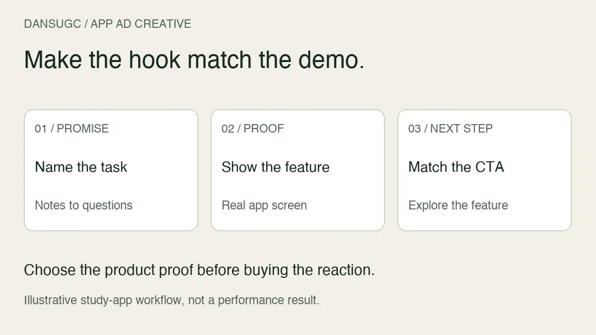
Use this three-part check before writing variants:
- Promise: What will a relevant viewer expect after the opening?
- Visible proof: Which screen, tap, or output supports that expectation?
- Next action: Can the viewer reach that feature after following the ad?
This is narrower than collecting catchy lines. Our broader UGC hook examples cover opening styles across products. Here, the job is matching an app-specific opening to a believable demo and acquisition journey.
What TikTok actually recommends
TikTok's creative best-practices guidance recommends introducing the proposition early, using a hook followed by selling points and a clear call to action, and designing vertical creative with important content inside the interface safe zone. It presents these as starting points for testing, not guarantees.
That is useful direction. It does not establish one winning reaction, a universal thumb-stop target, or a guaranteed reduction in acquisition cost. Avoid treating an editing convention as a result from your own account.
Six UGC hook-to-demo pairings for mobile apps
Every example below is hypothetical. Use a line only if your app genuinely supports the described feature. The footage direction describes a visual role, not a claim that the person is a customer. Do not attach first-person testimonials to unrelated stock or library reactions.
1. Replace a frustrating manual task
Illustrative hook: “Still turning lecture notes into revision questions by hand?”
Human shot: A person looking frustrated at a desk, with room for a short caption. Avoid a dramatic reaction that distracts from the task.
Demo: Select sample notes, create the questions, and show a readable question with its answer. If preparation or processing takes time, make any edit clear rather than implying instant completion.
CTA: Invite viewers to explore the question-building feature. Do not promise a better exam grade from footage of a generated question.
The hypothesis is that the manual task will be recognizable to the intended audience. It is not that frustration automatically outperforms every other emotion.
2. Show a specific feature discovery
Illustrative hook: “Your saved recipes can become a shopping list.”
Human shot: A restrained interested or surprised reaction. The caption describes the app, not the creator's personal discovery.
Demo: Choose saved recipes, generate the list, and show where ingredients can be edited. Keep the output large enough to read on a phone.
CTA: Point to the recipe-to-list workflow. If that feature requires a paid plan, do not present it as an unrestricted free tool.
This opening is useful when the feature itself is easier to understand than a broad brand promise such as “organize your life.”
3. Open on the finished output
Illustrative hook: “One screenshot. A calendar event you can edit.”
Human shot: Optional. You can start on the finished event, then use a brief reaction as a transition back to the source screenshot.
Demo: Show the sample screenshot, the extraction step, and the editable event details. Check the date and time before recording. If the app can make mistakes, do not imply its output never needs review.
CTA: Invite the viewer to try the import feature under its actual access conditions.
A library clip is not mandatory in every concept. When the product output already communicates the value, forcing a face before it may make the edit harder to follow.
4. Answer a practical objection
Illustrative hook: “Can you change the plan after the app creates it?”
Human shot: A curious or skeptical expression, without captions pretending the person independently reviewed the app.
Demo: Open a generated plan, edit one item, and show the saved version. Use this only if the change is supported in the product you are advertising.
CTA: Explore the editable planning feature.
This concept tests whether explaining control is more relevant than showing another generic output. It is not evidence that skeptical faces improve conversion.
5. Demonstrate a defined use case
Illustrative hook: “Practise ordering coffee before your trip.”
Human shot: Someone preparing for a trip or looking at their phone. Match the context to the task instead of relying on exaggerated surprise.
Demo: Select the coffee-ordering lesson, show one practice exchange, and reveal the feedback available in the app. Avoid implying that one lesson produces fluency.
CTA: Explore that lesson or the relevant course, depending on what the destination offers.
The strength of this idea is specificity: a viewer can understand the situation and see what they would do. Whether it attracts valuable users still needs measurement.
6. Make an existing workflow easier to see
Illustrative hook: “Give each study session a topic before you start.”
Human shot: A focused desk or phone-use clip rather than a testimonial.
Demo: Name a topic, set a study session, and start it. Show the actual timer or session view. Do not turn a feature demonstration into an unsupported concentration claim.
CTA: Explore the session-planning feature.
This is a different promise from the revision-question example. Both can use study-themed footage, but they need different demos and a clear path to the promised feature.
How to choose a reaction clip for the edit
Preview the entire clip, not just its thumbnail. Note where the expression begins, whether it resolves naturally, and whether the crop leaves space for your words. A useful moment in the middle can be more suitable than the opening frame.
Check whether the person's gaze makes sense next to the demo. If they look left, placing the product content on the opposite side may make the composition feel disconnected. Try the actual layout before buying several similar shots.
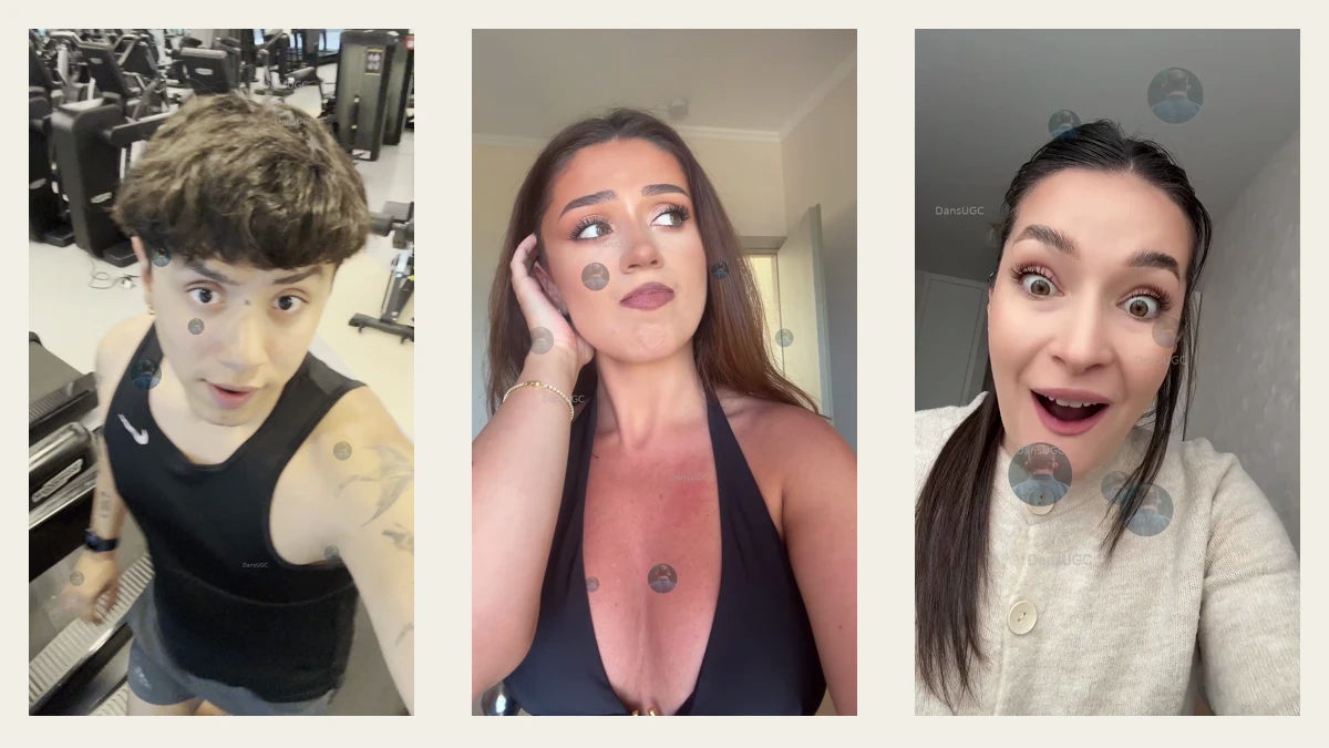
DansUGC's app-content examples illustrate reaction-then-demo, reaction overlay, and split-screen formats. They demonstrate editing structures; the illustrated apps are not customer performance evidence. Use them to choose a layout, not to predict your acquisition results.
For a library reaction, let the app screen carry the factual claim. If you need a person explaining their real experience, commission and verify that experience rather than writing “I use this every day” over an unrelated clip. Review the applicable license before distribution; a preview is not permission to run the asset in an ad.
An editor-ready hook brief
Here is a filled example for a hypothetical study app. It is a production instruction, not a real DansUGC customer campaign.
- Audience and situation: Students turning their own lecture notes into revision material.
- Feature promise: The app generates editable revision questions from supplied notes.
- Opening caption: “Turn these notes into revision questions.”
- Footage role: A curious desk reaction; no spoken endorsement or first-person result claim.
- Required demo: Sample notes, the generation action, one readable question, and the edit control.
- Visible restrictions: Show or explain access requirements if this feature is behind a subscription.
- CTA and destination: A truthful invitation to explore the feature, leading to the page or app experience where it is explained.
- Approval checks: Correct UI, readable output, safe sample data, licensed footage and audio, and no unsupported outcome claim.
Before exporting, ask someone unfamiliar with the app to describe what it does after one viewing. Their answer is a comprehension check, not a conversion-rate prediction. If they remember the face but cannot explain the feature, revise the connection between opening and demo.
For the full sequence after the opening, use our reaction-video app storyboard. Keep this brief attached to the source footage and final export so the next editor understands why each shot is there.
Test a hook hypothesis without confusing it with a new offer
Decide what you are comparing before making the edits. If the question is whether a task-led caption or an objection-led caption is clearer, keep the demo, offer, destination, and main production choices consistent where practical. If you change all of them, label it a broader concept comparison rather than a hook-only test.
Record the opening text, source clip, demo version, CTA, and destination for each export. Use meaningful version names such as notes-task-opening-A and notes-objection-opening-B. That is more useful during review than final-video-new-7.
Attention and clicks are diagnostic. For a subscription app, they are not substitutes for the downstream event your business needs. A curious audience can watch without wanting the product. Review event definitions, conversion delays, and whether there is enough evidence before declaring a winner. Do not choose a universal spend threshold or success rate from this article.
If performance has weakened across several creatives, check the broader problem with the UGC ad-fatigue diagnostic. Swapping a face will not fix a broken signup path, a mismatched offer, or missing measurement.
FAQ: UGC hooks for TikTok app ads
What is a UGC hook for a mobile-app ad?
It is the opening visual, caption, or spoken line that introduces the app's relevance. For a reaction-plus-demo edit, it should create an expectation that the following screen recording can satisfy.
Which hook works best for app installs?
There is no universal winner established here. Start with a truthful product task, feature discovery, or practical objection, then compare relevant outcomes in your own campaign. These examples are hypotheses, not ranked performance results.
Can I use a ready-made reaction with my screen recording?
Yes, when the applicable rights permit the intended edit and distribution. Keep the product claims in the demonstration and captions, and do not imply the creator is a customer or endorses the app unless that is genuinely established.
How long should the opening be?
Make it long enough to understand and short enough to reach the promised demonstration promptly. TikTok recommends introducing the proposition early. Test the complete edit rather than enforcing an exact duration as a guarantee of performance.
Can I reuse the same edit on Meta?
Treat it as an adaptation, not an automatic copy. Check the destination placement's crop, text visibility, audio rights, CTA, and current requirements. An idea that is useful on TikTok still needs its own evaluation on Meta.
Choose the demo, then choose the footage
Start with one feature you can show honestly. Write the matching promise. Then preview real-human reaction and B-roll clips for that specific edit. If you need someone demonstrating your actual app or delivering a genuine spoken explanation, compare ready-made clips with custom UGC before deciding what to buy.
The objective is not a louder opening. It is a clearer reason for the right person to keep watching and understand the product.
Ready to get UGC videos for your brand?
Real human creators, 48-hour delivery, 12-month commercial license. Starting at $9/video.